
Wedding Color Palettes for Every Season - A Photographer's Guide to What Actually Photographs Well

|
Key Takeaways
|
You sit down with a Pinterest board, a hundred swatches, and no clear way to narrow it down.
Most couples don't realize until later that wedding colors are not just decor. They show up in every photo you will ever look back on — your invitations, your bouquet, the way light hits your dress at golden hour.
A color palette that looks right in person does not always photograph the same way. This guide breaks colors down season by season, plus the lighting situations most couples never think about, so the choice gets easier instead of harder.
What Is a Wedding Color Palette, and Why Does It Affect Your Photos?
A wedding color palette is simply the small set of tones carried across your florals, attire, decor, and stationery. Most couples who get this right use a simple framework.
One dominant color that anchors the whole day
One secondary color that supports it
One accent color used in smaller doses
Here is why this matters specifically for photos. Lighting, skin tones, and backgrounds all interact with color differently than they do in person. A shade that looks soft and pretty on a swatch can read completely differently once it is sitting under venue lighting or full sun.
What Are the Best Wedding Colors for Every Season?

Every season comes with its own natural light, and the best wedding color schemes work with that light instead of against it. Think about it this way — the same blush pink that looks soft and romantic under spring's gentle haze can look completely different under the harsh midday sun of July, or under the warm, low light of a winter reception room.
Once you start choosing colors with the season's light in mind, the whole decision gets a lot less overwhelming.
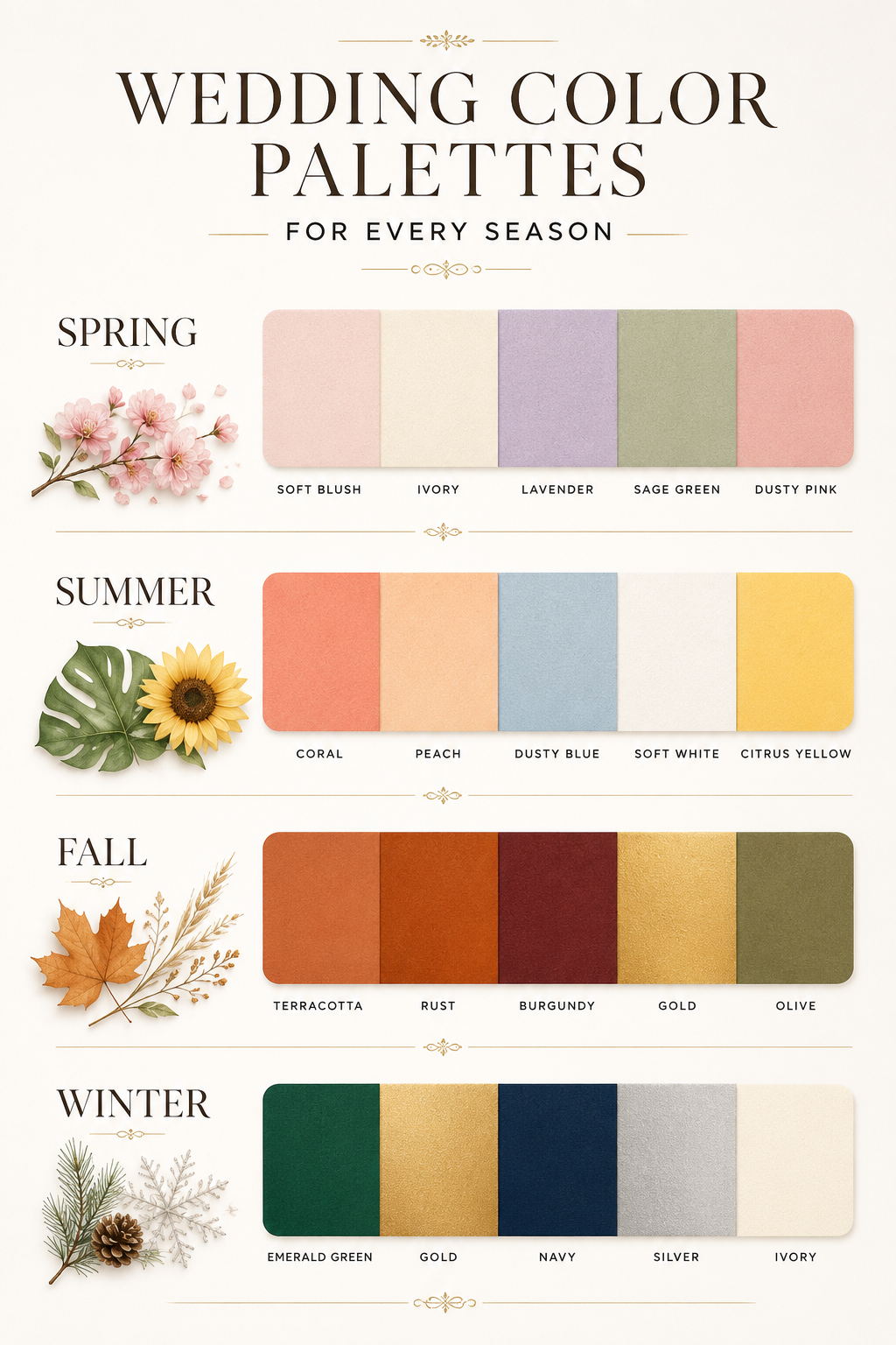
Spring Wedding Colors: Soft Light Done Right.
Spring light is soft and diffused, which is exactly why gentle, romantic tones photograph so well during this season. The sun sits lower, the light is gentler, and there is rarely the harsh contrast you get in the middle of summer.
This kind of light is forgiving, flattering, and ideal for pastel and soft-toned palettes that might otherwise wash out under stronger sun.
• Blush and ivory
• Lavender and sage
• Spring green and cream
• Soft peach and dusty pink for a slightly warmer take.
These spring wedding colors photograph as soft and airy, almost like the light itself is doing half the work for you. Spring blooms also naturally lean toward these tones, so your florals, your bridal party color schemes, and your overall palette tend to come together without much effort.
If your wedding falls in early spring, lean slightly cooler with lavender and sage. If it falls closer to late spring, warmer tones like peach and blush hold their depth better as the light gets a touch stronger.
Summer Wedding Colors: Bold Enough to Hold Up.
Summer brings strong, direct sun, and that changes the rules. Bold, saturated colors actually perform better under bright light than soft pastels do, which often wash out by midday.
• Coral and peach
• Dusty blue and white
• Citrus tones like lemon and tangerine
• Deeper jewel tones like teal for a bolder summer palette.
If your wedding colors for summer lean pastel, plan your portraits for early morning or closer to golden hour. This is the same reasoning behind timing an engagement session around softer light instead of the middle of the day.
Outdoor summer weddings also tend to photograph well against greenery, so palettes that include a true white or a citrus tone tend to stand out clearly against natural backdrops without looking washed out.
Fall Wedding Colors: Golden Hour's Best Friend.
Autumn light is warm and golden, and it makes deep, rich tones glow instead of overwhelming the frame. The lower angle of the sun during fall creates that signature golden hour glow earlier in the evening, which is part of why fall remains one of the most photographed wedding seasons of the year.
• Terracotta and rust
• Burgundy and gold
• Olive and mauve
• Chocolate brown and cream for a softer, more neutral take.
These colors come alive during golden hour portraits, when the natural light pairs with the richness of the palette instead of competing with it. Fall foliage also does a lot of the visual work for you, so palettes built around rust, burgundy, or olive tend to blend naturally into the background instead of clashing with it.
Winter Wedding Colors: Rich and Indoors:
Winter weddings usually move indoors, which means lower natural light and more reliance on venue lighting and flash.
This is exactly why winter palettes lean richer and moodier; deeper tones tend to hold their richness indoors in a way that pastels simply cannot.
• Emerald and gold
• Navy and silver
• Ivory and evergreen
• Black and white with metallic accents for a more formal look.
Deep colors stay true to themselves indoors, but it is worth asking your photographer how they handle flash with darker tones so nothing gets lost in the shadows.
Winter weddings also tend to lean more formal, so metallics like gold or silver paired with a deep base color photograph especially well under the warmer, ambient lighting most indoor venues use during the colder months.
What Most Couples Don't Realize About Color and Photos:
This is the part that does not show up on a Pinterest board.
Uplighting changes your colors after the sun goes down.
A reception room with warm amber uplighting will pull every cool blue or lavender tone warmer in your photos, whether your decor was originally cool-toned or not.
Flash reads saturation differently than your eye does.
Deep jewel tones like navy or emerald can punch brighter and flatter under flash than they looked on the fabric swatch.
Tented and mixed-light receptions put two color temperatures in the same frame.
String lights, fading daylight, and indoor flash can all land in one photo, which is part of why darker, richer tones tend to hold up more predictably than pale pastels once the sun goes down.
Greenery is already part of your palette, whether you planned for it or not.
Garden ceremonies, tree-lined cocktail hours, and foliage-heavy reception rooms all add a built-in green that your colors have to sit next to.
This holds whether you are getting married in a ballroom, a garden estate, a church, or a waterfront venue. The venue's own lighting and surroundings become part of your color story the moment the sun starts to set.
How Do You Pick a Wedding Color Palette That Photographs Well?
Instead of chasing trends, run through a quick gut check.
Do you love bold color, or do soft neutrals feel more like you?
Are you getting married in an indoor ballroom or an outdoor garden, since each pulls toward a different palette?
What colors does your venue already have, since starting there saves you from clashing with existing decor?
Is your day casual or black tie, since formality usually nudges your color combination one way or another?
There is no universally correct wedding color combination. There is only the one that matches your day, your venue, and how you actually want your photos to feel.
Why Should Your Photographer Be Part of This Conversation Early?

Here is something most couples do not think about until the colors are already chosen. An experienced wedding photographer can flag tones that look right in person but flat or muddy on camera — before you have spent money on decor that does not photograph the way you imagined.
We cap our calendar at thirty weddings a year, which means every couple gets an actual planning conversation with both of us before the wedding day, not a templated checklist. Color is part of that conversation.
Saves you from costly color choices that do not translate to photos
Sets realistic expectations for lighting at your specific venue
Keeps your color palette and your photography style working with each other instead of against each other
Coordinating this early, the same way we walk couples through venue lighting before the big day, keeps everything calmer once the day actually arrives.
What Wedding Colors Will You Still Love Twenty Years From Now
The best wedding color palette is not the trendiest one on Pinterest. It is the one that still feels like you when you open your anniversary album years from now.
If you want a clear answer on how your colors will actually hold up at your venue, in your season, under real lighting, that is part of what we walk every couple through before the wedding. Check your date.
Related Read: Wedding Planning Tips for a Calm, Well-Documented Day
FAQs
-
Sage green, dusty blue, terracotta, and ivory remain some of the most popular wedding colors. Couples tend to gravitate toward soft, natural tones that photograph well across different lighting and feel timeless rather than tied to a passing trend.
-
In 2026, couples are choosing more personalized palettes instead of chasing one universal "it" color. Earthy neutrals like terracotta, sage, and warm taupe remain popular, but bold, saturated tones — emerald, cobalt, chartreuse — show up just as often, especially at garden and waterfront weddings. The bigger shift is fewer couples picking two safe, matching colors and more building layered palettes with a dominant color, a secondary color, and an accent, chosen for how the day should feel rather than what's trending.
-
A strong three-color combination usually includes one dominant color, one secondary color, and one accent. For example, blush, ivory, and sage, or navy, gold, and ivory both create balance without overwhelming your photos or decor.
-
Matching your colors to the season is not required, but it does make planning easier and often photographs more naturally. Seasonal light, like spring's softness or fall's golden glow, tends to complement colors already associated with that time of year.
-
Beauty here is subjective, but blush, sage, terracotta, and navy consistently rank among the prettiest wedding colors. Each one photographs well under different types of light, which is part of why they remain popular year after year.